Chocolates - an absolutely mouth-watering word. Lately I have been working on developing an identity for a chocolate brand, it included packaging. Chocolate packaging can be very interesting and allows for a lot of creativity... I'll say it again chocolate rules.... Anyhow I sat down with my laptop to find some interesting packaging ideas... and did I get my worth !!!!

Below you will see some that truly captured my attention. From Clinical to Frivolous. From Minimalistic to Ornate. There is a whole gamut of beautiful designs !

The above was a particulary intresting concept. The Bloomsberry Medical Chocolate packaging parodies on popular medical products from Birth Control to Botox. A humourous and witty take on modern medicine with a scrumptuos twist.


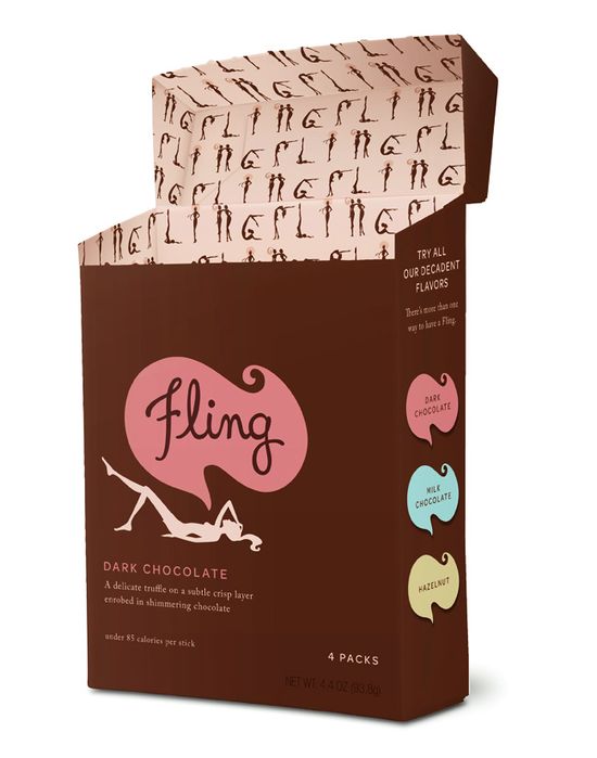
Fling, a new chocolate bar for the calorie-conscious, chocolate-loving fashionista. I really love the third concept. It makes me feel like I would be indulging in something worth the calories. The colours, and fine lined art make the product seem lighter and therefore not as bad for you as the darker, fuller lined box. Though their dark brown box


Askinosie chocolate packaging has got to be one of my favourites. Their concept is very impressive, they all carry a rugged military ration feel with distressed labels that brings to mind war times, old typewritten forms and stamps. The bars feature a wonderful waxy paper that becomes naturally marred like a rugged leather.


Kshokolat is a Scottish chocolatier that uses very minimalist and contemporary packaging. Very bold and seductive.

The My World Chocolate brand was driven by a concern that there's a loss of innocence in children's brands. It's a personal thing for a child. 'My World is about fantasy and naivety. And the use of children's books illustration is adorable ( Ok ..yeah I do have a soft corner for kiddie illustrations)


Their packaging is colorful, informative and simple– displaying a numeric value for each chocolate, the location of its birth and basic details about its flavor. It belongs to a chocolate brand in a cafe in Japan.

Co Couture chocolates - Simple, sexy, stunning, this simple, black box with the branded Co Couture has a subtle touch of color within The series includes a range of flavored chocolate that is as strong and serious on your tongue as the design is to your eyes. Bon apetit, Co Couture!

Mast Brother's line uses funky, wallpaper-style patterns to adorn their latest chocolate bars, Those rich, flowery stylings was very fuddy duddy during granpa times but are so retro and popular today.


The packaging for No9 Chocolate (les noix chocolatees) needs a close look if you are truly to understand it. It is comprised of a cardboard box with nine foil circles arranged on the top. Puncture one of the foils to expose a fine piece of chocolate shaped like a walnut– then take a bite and enjoy. When you’re done with the package, it is fully recyclable, leaving little to no waste from this chocolate experience. Nicely done.

The Divine Chocolate labeling is adorned with playful patterns and the delightful Divine logo, suggesting that this chocolate is for the rich-at-heart and the playful-in-spirit.

Here is packaging that is so delightfully insulting. These bright pink squares of chocolate make fun of you while you eat them, shouting “oink!” with every bite. The front side shows a cartoon pig snout, while the rear explains that you’d better shove these in your gullet quick– before another fat pig walks by and asks you for a piece. Hey, I suppose I can’t argue with that…

Original Beans Chocolate has developed packaging that is as refined and environmentally-conscious as the chocolate brand itself. Beyond the rich, floral design and raised globe icon, the packaging was produced in an entirely wind-powered factory. What’s more, Original Beans Chocolate plants a tree for every box of chocolate they sell. The design preaches a refined sense of environmentalism, and the company backs it up with sustainable business practices.


Now am I not ending on a very interesting note...It’s clear that Victorinox has a sense of humor… as well as a sweet tooth. These chocolates are a celebration of the brand’s bold red iconography born again in chocolate. Aren't they functionally delectable !!!!!!! YUM.
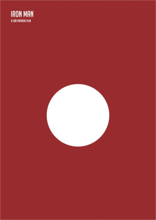
 I have come across so many minimalistic movie posters in my late night web surfing lately that I thought Its about time I posted some of my favourites..the ones that ring true use a pure notion or idea from the film at hand in a clever way. A stroke here and a dash of colour there... Thats all it really takes... Hope you enjoy them .. :)


